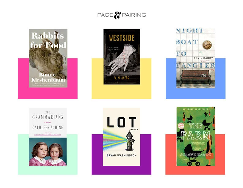
Design of Brand Identity, Landing Page, Email Series, and Social Media Collateral for launch of Page & Pairing. A new program curating reading recommendations with wine and food pairings.
Branding and website design for interiors firm Heather Garrett Design
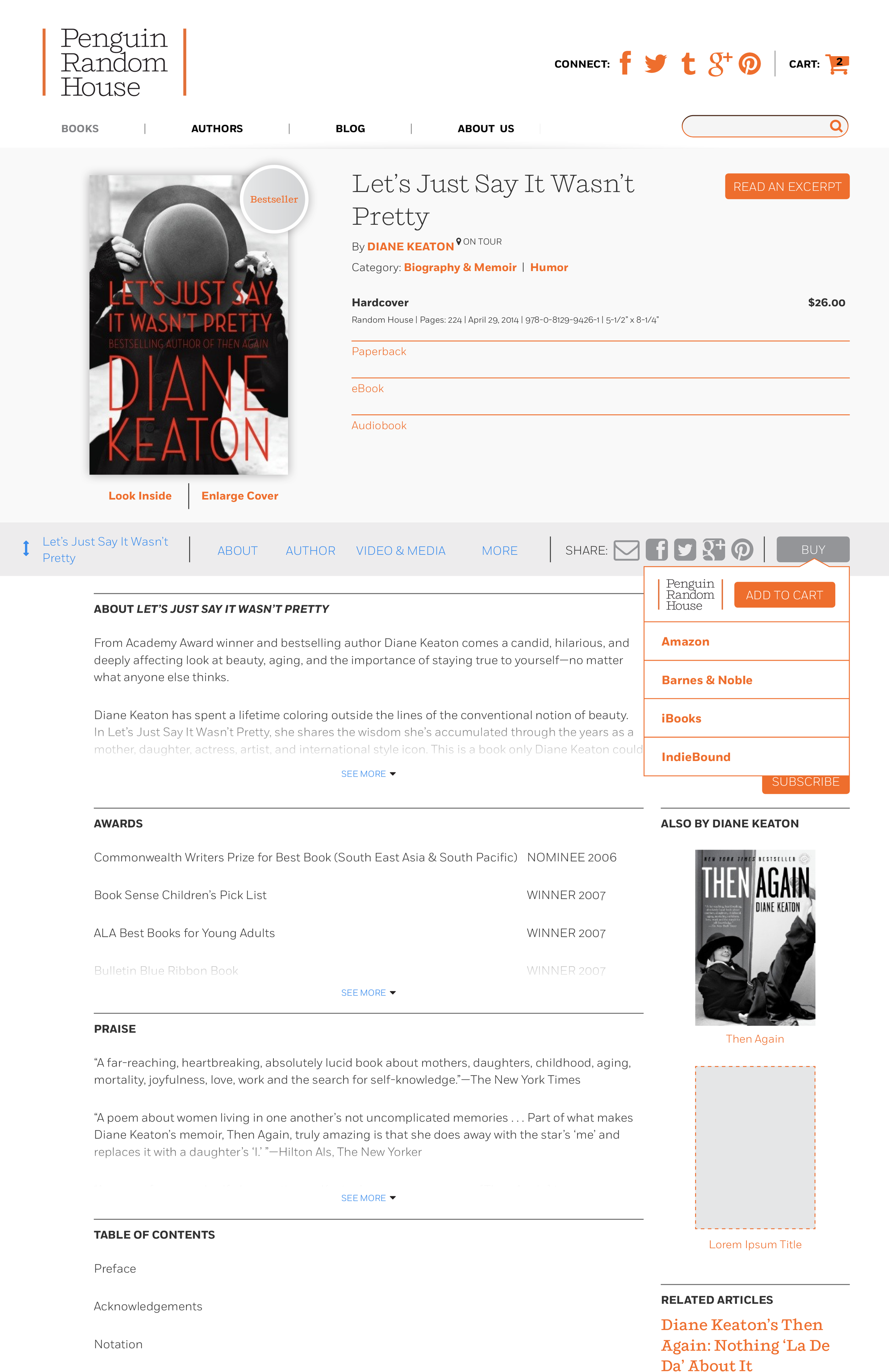
The first site to showcase the newly formed merger of Penguin and Random House. The homepage is meant to be the online face of the company and an opportunity to showcase newly published books as well as engage readers to receive personalized book recommendations. The page is designed with various components to support curation as well as dynamic book suggestions.
The primary template of the site is the book detail page as it’s the most highly trafficked. The responsive design took each screen experience into consideration as well as an agile approach to allow for design and analytics to work together in coordination to determine a product roadmap.
Read it Forward is a book recommendation site meant to address the reading tastes of a female millennial audience. The campaign and editorial illustrations not only reflect the joy of reading in the summer season but strive to be inclusive of a broader audience.
The Signature wordmark was created to evoke a classic yet bold mood. Inspired by some of the literary mastheads, the “S” is also used on it’s own for brand identity purposes where space is limited as in social channels.
I conceived a modular approach for the design and function of the homepage with the purpose of giving editorial the most flexibility. Each module is a basic building block for the page and can be moved around to create different configurations and layouts. The content can be served dynamically by category and tags or fully curated by editors. All modules are mobile optimized.
The Read it Forward Holiday Campaign focused on unique traits or interests for each of the book lovers on your holiday list.
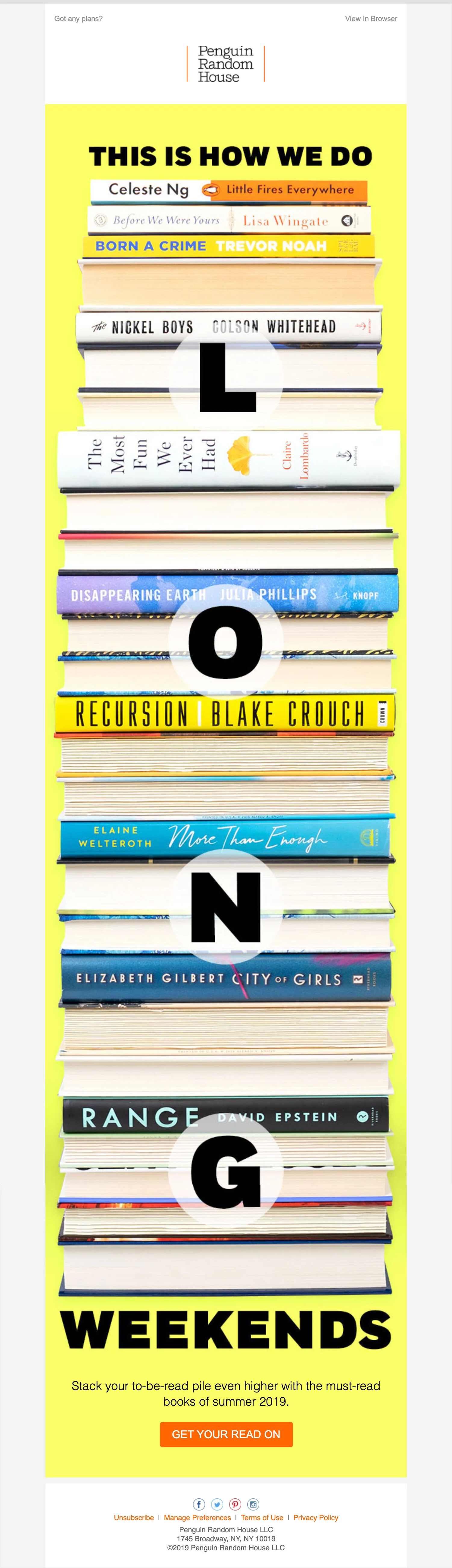
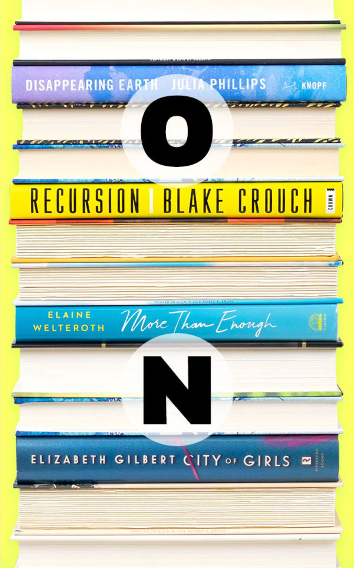
The email design including photography was a playful way to reflect the benefits of a long weekend when you have a stack of really good books to enjoy! The extreme length of the visual was designed to encourage the viewer to scroll down and see all the book spines with a cta to discover the full list.
This campaign was in celebration of Hispanic Heritage Month and designed to reflect the diversity of Hispanic and Latino diaspora in literature. The visuals were comprised of different photographic shots framed with waves of color for use in editorial, social, and email.
Visual design inclusive of branding, wordmark, social brandmark, site design and weekly/daily email newsletter.
The design of this email was meant to capture the spirit of the eighties when the art of the mixed tape could tell a story by its maker through song selection as well as being an analogy for the writing process.
For Friendship Day, this email highlighted four different thematic book recommendations. The direction of the photography is meant to reflect a visual style associated with social apps. The photos were sourced from stock and lighting was different for each. To make them more cohesive, a simple overlay tint was used to unify the four visually.
In celebration of Ice Cream Day, an email was designed to drive to a list of books connected to the sweet treat.
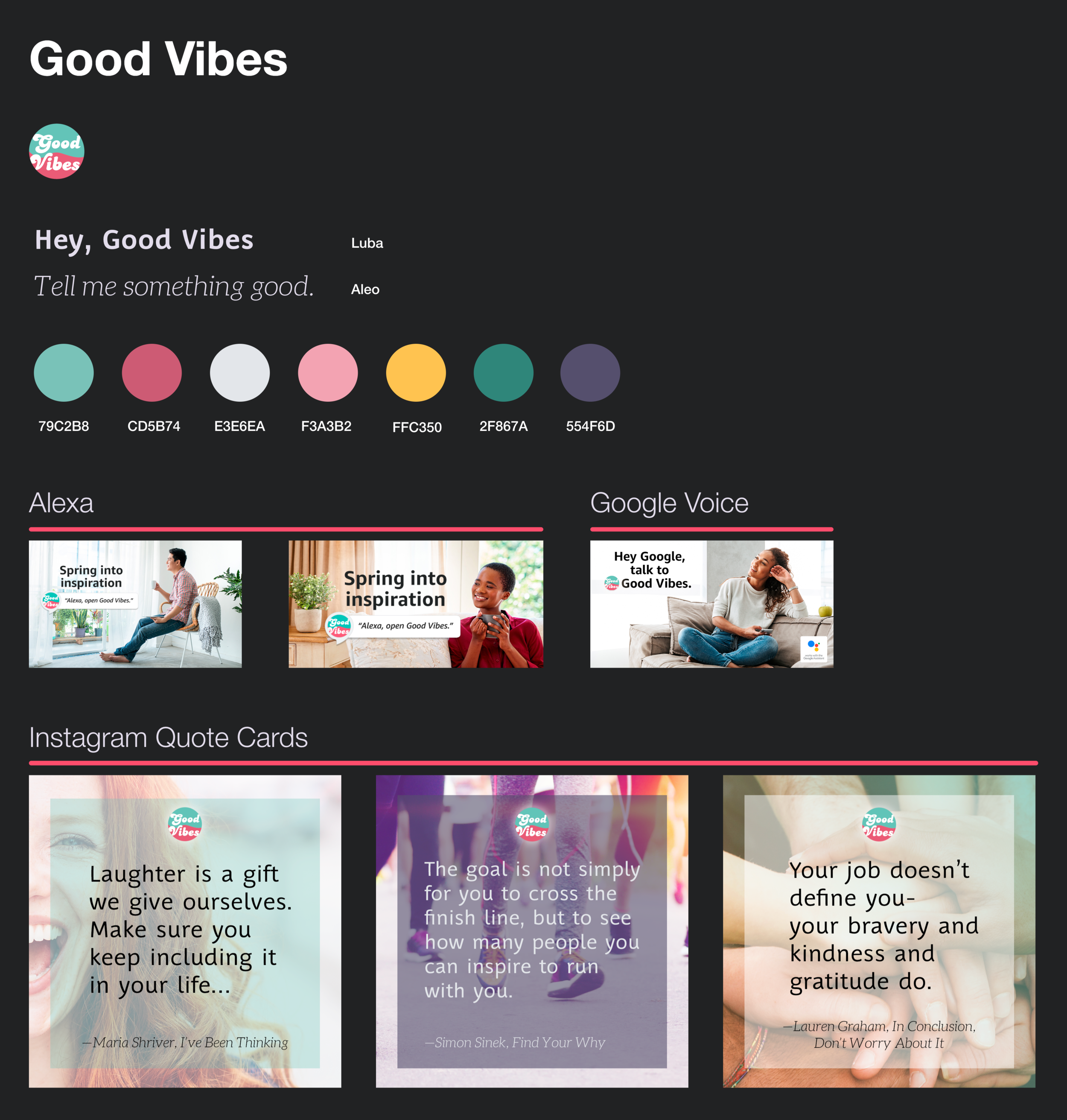
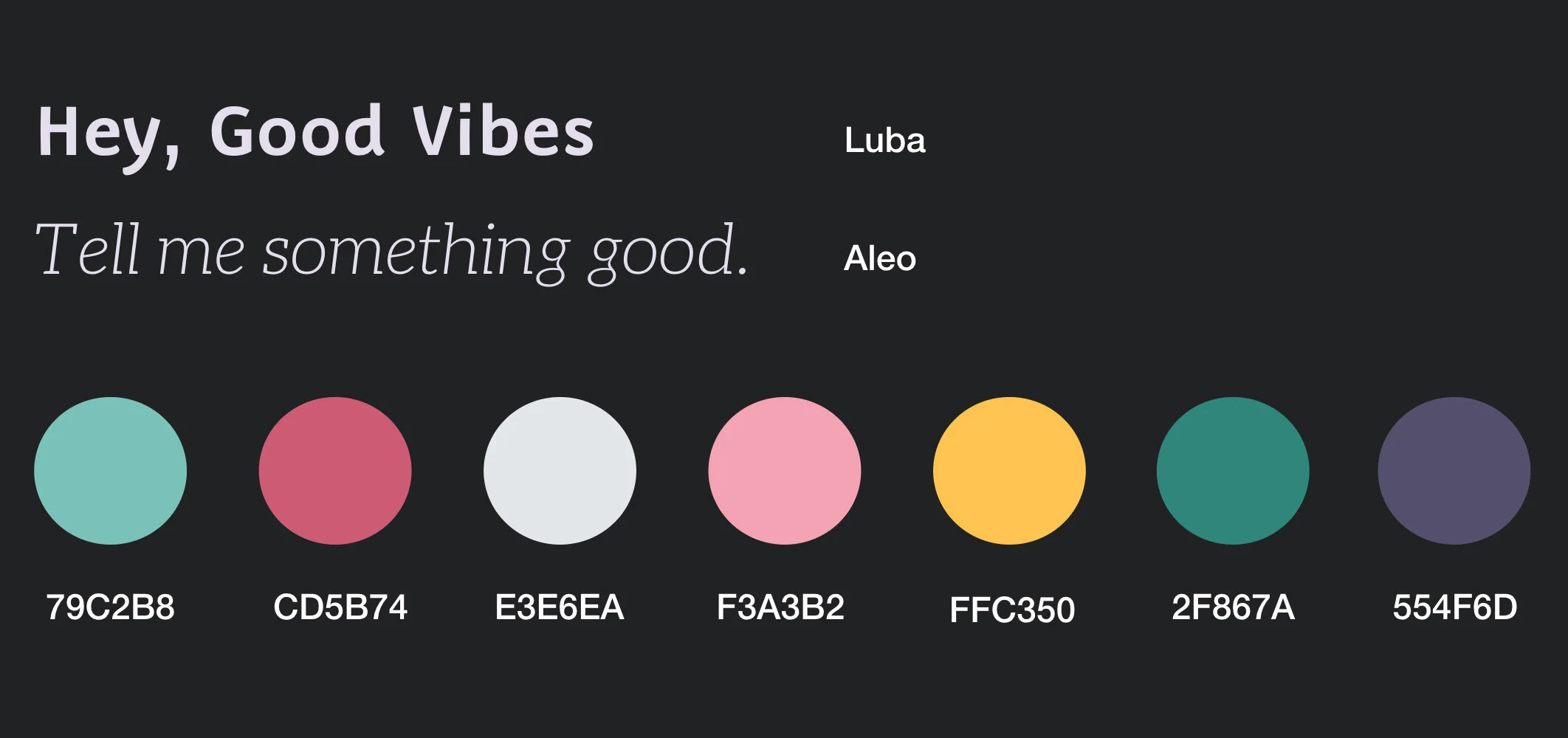
Design of social media assets to promote the Good Vibes voice skill on Alexa and Google used typography and illustration to capture the spoken words where some are stressed more than others. The voice skill offers up quotes of daily inspiration by authors.
Along with the social media assets, the brand wasn’t clearly visually defined yet. A supporting style guide was created to capture a palette, typography and photographic style when the brand needed to be presented visually.